 Tom Zargaj
1 min read
NetSuite Data Security Features You’ll Wish You Explored Sooner
ERP systems hold the most sensitive operational data in an organization: financial records, customer information, vendor contracts, payroll details,...
Finance teams waste hours each week scanning dashboards that show too much, trigger nothing, and drift out of sync with current business logic. The problem isn't the platform. NetSuite offers powerful dashboard capabilities, including KPI meters, trend graphs, saved searches, report snapshots, and role-based portlets. The problem is how those elements are selected, arranged, published, and maintained.
A cluttered dashboard with duplicate metrics, stale filters, and mismatched role visibility creates confusion instead of insight. Real-time data loses value when the dashboard layout buries exceptions under decorative graphs or when a NetSuite user sees KPIs that don't connect to daily workflow. Dashboard effectiveness depends on role fit, metric discipline, portlet selection, publishing governance, and regular review cadence.
This guide covers:
P.S. Dashboard value depends on more than default layouts and standard KPIs. Centium provides NetSuite Customization Services that include advanced UI and reporting enhancements, custom workflows, automation, and role-specific dashboard views tailored to your operational needs. Schedule a free NetSuite trial to explore how role-based dashboards and custom portlets can improve visibility and decision speed.
|
Best Practice Area |
What To Do |
|---|---|
|
Role-Based Design |
Configure separate dashboards for finance, operations, and sales roles so each user sees only KPIs tied to their daily workflow and decision authority. |
|
KPI Selection |
Limit each dashboard to 5 to 8 key performance indicators that trigger follow-up, inform resource allocation, or track threshold performance. |
|
Portlet Mix |
Use KPI meter for threshold monitoring, trend graphs for pattern recognition, saved searches for exception lists, reminders for tasks, and report snapshots for recurring review packs. |
|
Layout Discipline |
Place high-value KPIs and exception lists above the fold, remove duplicate graphs, and eliminate low-priority dashboard tiles that slow review without adding insight. |
|
Review Triggers |
Build dashboards around exception monitoring, threshold alerts, and follow-up prompts instead of passive display of real-time data that requires manual interpretation. |
|
Publishing Governance |
Publish baseline dashboards by role, allow local customization for portlet order and thresholds, and assign dashboard owners to track configuration changes and prevent drift. |
|
Maintenance Cadence |
Audit portlets quarterly, check metric definitions when business rules change, remove stale saved searches, and trigger dashboard refresh when role responsibilities shift. |
Dashboard design decisions determine whether a NetSuite dashboard supports faster review or creates confusion. Role fit, metric selection, portlet mix, layout discipline, and review triggers have the biggest effect on visibility, scan speed, and trust in day-to-day use. Teams that configure dashboards without clear design rules end up with crowded layouts, duplicate KPIs, stale saved searches, and low adoption.

Role-based dashboards work because they show only the metrics tied to daily actions. A sales team dashboard should prioritize sales orders, pipeline visibility, and customer activity. A finance dashboard should focus on cash flow, bank balance, days' sales outstanding, and gross profit percentage. An operations leader needs inventory exceptions, fulfillment status, and production metrics. When every role sees the same dashboard, usefulness drops.
Finance Dashboard Focus: Track cash flow forecasts, bank balance, receivables aging, revenue recognition status, and budget variance. Remove sales pipeline metrics, production bottlenecks, and inventory exceptions that don't inform finance actions. Configure KPI meters for liquidity thresholds and saved searches for overdue invoices or unreconciled transactions.
Sales Center Dashboard Focus: Track sales trends, open opportunities, quote-to-close velocity, win rate, and quota attainment using trend graphs for pipeline movement and KPI meters for monthly targets. Remove financial close metrics, intercompany reconciliation status, and operational fulfillment detail. Use saved searches to surface stalled deals, overdue follow-ups, and customer engagement gaps.
Operations Leader Dashboard Focus: Surface inventory shortages, order fulfillment delays, production bottlenecks, and vendor performance using saved searches for exception lists and KPI meters for fulfillment SLA tracking. Remove revenue recognition status, cash flow forecasts, and sales pipeline metrics. Configure reminders for purchase order approvals, shipment delays, and quality control flags.
Executive Dashboard Focus: Compare performance across entities, regions, or business units using scorecards for quarterly revenue growth, customer retention, and strategic initiative tracking. Remove operational detail, daily exception lists, and task-level reminders. Use trend graphs for profitability analysis, market expansion, and cost variance trends.
Choosing key performance indicators that trigger review improves dashboard scanning. Crowded KPI stacks slow interpretation. A metric that can be interpreted quickly and drives a clear next step belongs on a dashboard. A metric that requires explanation, context, or secondary analysis doesn't.
Select KPIs That Align to Decision Authority: Finance roles need cash flow, DSO, and gross profit percentage. Sales roles need pipeline velocity, win rate, and quota attainment. Operations roles need fulfillment, SLA, inventory turnover, and production efficiency. Remove KPIs that don't trigger follow-up or inform resource allocation.
Avoid Duplicate KPI Display: Remove KPIs displayed across multiple portlets, graphs, or scorecard views on the same dashboard. If gross profit percentage appears in a KPI meter, a trend graph, and a scorecard, consolidate it into the format that best supports the review task.
Use Threshold-Based KPIs for Exception Monitoring: Configure KPI meters that change color or trigger alerts when performance crosses a defined boundary, such as cash flow below operating threshold, DSO above target, or inventory below reorder point.
Remove Vanity KPIs: Audit KPIs quarterly and remove metrics that look impressive but don't inform decisions or trigger actions. If a KPI hasn't prompted discussion, follow-up, or resource allocation in the past quarter, remove it.
Choosing the right portlets affects scan speed, interpretation, and usefulness. A KPI meter works well for threshold monitoring. A scorecard compares multiple metrics against targets while trend graphs visualize patterns over time. Similarly, report snapshots deliver consistent review packs, and reminders surface follow-up tasks.
|
Dashboard Need |
Best NetSuite Element |
Best Use Case |
Misuse Risk |
|---|---|---|---|
|
Threshold Monitoring |
KPI Meter |
Track metrics that trigger action when they cross a defined boundary, such as cash flow below target or DSO above threshold. Configure color-coded thresholds so users can scan status without reading numbers. |
Overloading the dashboard with too many meters reduces scan speed. Limit KPI meters to 3 to 5 per dashboard and prioritize metrics that require daily or weekly threshold monitoring. |
|
Performance Comparison |
Scorecard |
Compare multiple KPIs against targets or benchmarks in a single view for executive or team review. Use scorecards for monthly or quarterly performance assessment across regions, business units, or product lines. |
Using scorecards for operational exceptions creates confusion. Scorecards work best for periodic review, not real-time exception monitoring. |
|
Pattern Recognition |
Trend Graph |
Visualize sales trends, gross profit percentage changes, or cash flow patterns over weeks, months, or quarters. Use trend graphs to identify seasonal patterns, growth trajectories, or performance declines. |
Short time windows or irrelevant metrics turn graphs into decoration that slows review. Match graph time windows to the business cycle and remove graphs that don't change decisions. |
|
Exception Lists |
Saved Search |
Surface overdue invoices, unfulfilled sales orders, inventory shortages, or approval bottlenecks. Configure saved searches with stable filters, clear ownership, and refresh logic tied to current business rules. |
Stale filters or unclear ownership undercut trust in search results. Review saved search criteria quarterly and update filters when business rules change. |
|
Recurring Review Packs |
Report Snapshot |
Deliver standardized financial or operational reports that support consistent weekly or monthly review routines, such as monthly close packs, sales summaries, or quarterly performance reviews. |
Low-priority or outdated snapshots clutter the dashboard. Remove snapshots that no longer match current review routines or reporting requirements. |
|
Follow-Up Prompts |
Reminder |
Flag tasks, approvals, or deadlines that require immediate attention, such as purchase order approvals, contract renewals, or compliance deadlines. |
Overuse of reminders for low-priority items reduces their effectiveness. Limit reminders to high-priority tasks that require same-day or same-week follow-up. |
Dashboard layout priorities determine whether high-value content is visible or buried. Keep the most important KPIs, exception lists, and action triggers above the fold on the home dashboard. Remove duplicate graphs and low-priority tiles that slow down review. Place threshold-based KPI meters in the top row so users can scan status immediately.
Position exception lists and saved search results in the second row so follow-up tasks are visible without scrolling. Additionally, move trend graphs and report snapshots below the fold when they support periodic review rather than daily action.
Using reminder portlets, threshold-based KPIs, exception searches, and follow-up cues turns dashboards into decision tools instead of passive displays. A dashboard should prompt action on sales orders that need approval, overdue items that require follow-up, or cash flow changes that affect liquidity planning.
Reminder Portlets for Immediate Follow-Up: Configure reminder portlets to surface tasks, approvals, and deadlines that require same-day or same-week action, such as purchase order approvals, contract renewals, compliance deadlines, or customer follow-ups. Link reminders to workflow triggers so they appear automatically when action is required.
Threshold-Based KPIs for Exception Monitoring: Configure KPI meters that change color or trigger alerts when performance crosses a boundary, such as cash flow below operating threshold, DSO above target, inventory below reorder point, or sales pipeline coverage below quota requirement.
Saved Searches for Exception Lists: Build saved searches that filter for exceptions, outliers, or status changes instead of displaying full record lists such as overdue invoices beyond 60 days, unfulfilled sales orders beyond SLA, inventory items below safety stock, or approval requests pending beyond 48 hours.
Trend Graphs with Context: Pair trend graphs with threshold lines, target benchmarks, or prior-period comparisons so users can interpret whether a pattern requires action or falls within normal variance. A sales trend graph should show quota targets. A cash flow graph should show a minimum operating balance.
Read Next:
NetSuite Financial Management Modules: Everything Finance Teams Need to Know
How NetSuite CRM Transforms Customer Service and Strengthens Loyalty
Dashboard components stop being useful when teams choose the wrong format for the job, pull from unreliable data, or show the same content to the wrong audience. Even when dashboards can be customized, the real goal is not to add more widgets. It is to make each element easier to review, easier to trust, and easier to act on. In NetSuite ERP, small dashboard choices can have an outsized effect on daily reporting quality.

Saved search portlets become unreliable when no one maintains the logic behind them. At first, the results may look accurate, but that changes quickly when business rules shift, and the filters stay the same. A search built around old status definitions, outdated date logic, or no-longer-relevant criteria can mislead users without making the problem obvious.
To prevent that, assign an owner to each saved search used on a shared dashboard. That person should review the filters regularly, update them when workflow or reporting logic changes, and document why the criteria were set up that way in the first place. Teams should also test search results against known records before publishing them broadly. This is especially important in organizational dashboards that multiple roles rely on for the same review process.
Report snapshots work well when they support a review habit the team already has. They become clutter when they remain on the dashboard after the routine has changed. A monthly AR aging snapshot may be useful for a finance dashboard, while a sales-by-region snapshot may support a weekly leadership review. But if those reports are no longer part of an active process, the snapshot adds one more thing to scan without adding value.
A better approach is to keep snapshots tied to recurring review packs and schedule them to refresh automatically. That makes the dashboard easier to maintain and more consistent for users who depend on those reports. Teams trying to create dashboards for shared use should be especially selective here, because old snapshots tend to linger long after the original purpose disappears.
KPI meters and scorecards are not meant to do the same job, and dashboards become less clear when teams treat them as if they are. A KPI meter works best when users need to check a threshold quickly, such as a cash balance falling below a target, orders slipping past SLA, or inventory dropping under a reorder point. A scorecard is better when the goal is to compare several performance measures over a weekly, monthly, or quarterly period.
The mistake is not in using either portlet. The mistake is using the wrong one for the review frequency. If a team needs a quick daily read, a scorecard often adds more detail than necessary. If leadership needs a broader comparison across regions or business units, a KPI meter is usually too narrow. When teams create dashboards, they should match the portlet to the review task instead of defaulting to whatever looks familiar.
Trend graphs are only helpful when the time window matches the business cycle behind the metric. A graph can look informative while still giving the wrong impression if it is too short, too compressed, or disconnected from how the business actually runs. That is when teams overreact to normal fluctuation or miss a larger pattern that only becomes visible over a longer period.
For example, a sales trend graph often needs at least 12 months of data to show seasonality clearly. A cash flow graph is more useful with a rolling 13-week view because it supports short-term planning. Margin or profitability graphs may make more sense quarterly if that is how performance is evaluated. If a graph does not help users spot a meaningful change or optimize a decision, it does not need to stay on the dashboard.
Read Next:
NetSuite Analytics And Reporting: Real-Time Business Performance Monitoring
NetSuite SuiteAnalytics Workbook Tutorial: Build Custom Reports and Visualize ERP Data
Even effective dashboards become less reliable when no one reviews the logic, layout, and reporting cadence behind them. Regular review helps teams keep dashboard content aligned with current business needs and avoid stale metrics or outdated searches. It also makes it easier to trust what users see within NetSuite and use that information to make better decisions.

Dashboard metrics should be reviewed any time the rules behind the data change. That includes updates to revenue recognition, order status definitions, cash flow forecasting logic, approval workflows, or any saved search criteria tied to those processes. When that happens, teams should check the KPI formula, the saved search filters, the date logic, and any status mappings used in the dashboard to make sure they still match current operations.
A practical review process is to compare the dashboard output against a known report or sample set of transactions, confirm the numbers match, and document what changed so future updates are easier to manage.
A dashboard becomes harder to use when it includes portlets people routinely skip, duplicate KPIs shown in multiple formats, or saved searches that no longer return useful results. These are signs that the dashboard in NetSuite is carrying old reporting habits instead of current priorities.
Remove portlets that users consistently ignore: Track which portlets users click, which KPIs prompt discussion, and which saved searches lead to action. If a portlet has not been used, discussed, or acted on in the past quarter, it likely does not need to stay.
Eliminate duplicate KPIs across multiple formats: If gross profit percentage appears in a KPI meter, a scorecard, and a trend graph, keep the format that best supports the review task and remove the rest.
Archive saved searches that return empty or irrelevant results: Review saved search outputs quarterly to confirm they still match current logic and reporting needs. Update filters when business rules change, and remove searches that no longer support a clear review purpose.
Which metric types need daily, weekly, monthly, or quarterly review depends on decision cadence and operational rhythm.
|
Metric Type |
Example Dashboard Item |
Recommended Review Cadence |
Follow-Up Trigger |
|---|---|---|---|
|
Liquidity Monitoring |
Bank balance, cash flow, available credit |
Daily |
Balance drops below the operating threshold, or the forecast shows a shortfall within 7 days. Trigger immediate liquidity review, credit line activation, or payment prioritization. |
|
Order Fulfillment |
Unfulfilled sales orders, backorder status, shipment delays |
Daily |
Orders exceed fulfillment SLA, or inventory shortages block shipment. Trigger expedited fulfillment, customer communication, or inventory reallocation. |
|
Receivables Management |
Days' sales outstanding, overdue invoices, and collection aging |
Weekly |
DSO exceeds the target, or the overdue balance increases beyond tolerance. Trigger collection follow-up, credit hold review, or escalation to management. |
|
Sales Performance |
Sales trends, pipeline velocity, win rate, quota attainment |
Weekly |
Pipeline coverage drops below the target, or the win rate declines for two consecutive weeks. Trigger sales coaching, pipeline review, or resource reallocation. |
|
Financial Close |
Revenue recognition status, accrual accuracy, and intercompany reconciliation |
Monthly |
Close cycle extends beyond the target, or reconciliation variances exceed the threshold. Trigger a close process review, variance investigation, or workflow adjustment. |
|
Profitability Analysis |
Gross profit percentage, operating margin, and cost variance |
Monthly |
Margin compression exceeds tolerance, or cost variance trends upward for two months. Trigger pricing review, cost reduction initiative, or product mix analysis. |
|
Strategic Performance |
Quarterly revenue growth, customer retention, and market expansion |
Quarterly |
Performance falls below plan, or strategic initiative tracking shows delays. Trigger strategic planning review, resource reallocation, or initiative reprioritization. |
Read Next:
Dashboard setup gets more complicated when teams need to compare performance across entities, business units, regions, or currencies while still supporting day-to-day work at the local level. A layout that works for one team often breaks down when the same dashboard is used for executive review, cross-entity comparison, and operational follow-up at the same time.
To make dashboards within a multi-entity environment more useful, teams need to separate local and consolidated views, standardize the logic behind shared metrics, and make sure comparisons reflect the same calendar and currency assumptions. This is one of the most important parts of aligning dashboards in a way that supports consistency across the organization without losing the detail people need to act.

Teams should not use the same dashboard for daily operational follow-up and executive comparison. Local teams need a focused dashboard that highlights exceptions, fulfillment issues, approvals, and other items that require immediate action. Executive users need a summary view that compares high-level performance across entities, regions, or business units without pulling in record-level detail that slows review. A better setup is to keep operational dashboards tied to local workflows and use separate summary dashboards for consolidated performance tracking.
Cross-entity dashboards only work when the numbers mean the same thing in every entity being compared. Before using custom KPIs in a shared dashboard, confirm that revenue recognition, cost allocation, status handling, and workflow definitions are consistent enough to support a fair comparison.
If they are not, document the differences clearly or adjust the metric logic before rollout. This is especially important when teams are designing role-based dashboards for leadership, because small definition gaps can create misleading comparisons at the top level.
Document KPI Definitions for Cross-Entity Metrics: Document KPI definitions for metrics such as gross profit percentage, days sales outstanding, and cash flow before using them in cross-entity dashboards. Confirm that revenue recognition rules, cost allocation methods, and operational workflows are consistent across entities.
Align Reporting Calendars Across Entities: Align reporting calendars so monthly, quarterly, and annual comparisons reflect the same time periods across all entities. Confirm that fiscal year definitions, month-end close dates, and quarter boundaries are consistent.
Use Consistent Currency Handling: Configure dashboards to display metrics in a single reporting currency or document currency conversion assumptions so users understand how exchange rates affect performance comparison.
Read Next: NetSuite OneWorld for Global Business Management and Multi-Entity Growth
Oracle NetSuite dashboards improve visibility when role fit, metric discipline, portlet selection, publishing governance, and maintenance cadence are treated as operational requirements rather than one-time configuration tasks. Dashboard value depends on matching content to daily workflow, limiting KPIs to useful metrics, using the right portlet for each job, keeping layouts clean, and building around review triggers instead of passive display. Teams that publish dashboards without governance create inconsistency. Teams that skip maintenance routines end up with stale saved searches, duplicate KPIs, and low adoption.
Key takeaways:
Dashboard design, customization, and reporting structure require more than default layouts and standard KPIs. Centium provides NetSuite Consulting Services and NetSuite Customization Services that include advanced UI and reporting enhancements, custom workflows, automation, and role-specific dashboard views tailored to your operational needs.
Schedule a free NetSuite trial to explore how custom portlets, role-based dashboards, and disciplined reporting structures can improve visibility and decision speed across your organization.
Dashboards provide ongoing visibility through real-time portlets, KPI meters, trend graphs, and saved search results displayed on a single screen. Standard reports deliver structured, detailed analysis designed for periodic review, export, or compliance documentation. Dashboards support faster scanning and exception monitoring. Reports support deeper investigation and formal review packs.
KPIs that trigger follow-up, inform resource allocation, or track performance against thresholds belong on a dashboard. Selection logic depends on role, review cadence, and usefulness. Finance roles need cash flow, DSO, and gross profit percentage. Sales teams need pipeline velocity, win rate, and quota attainment. Operations leaders need fulfillment SLA, inventory turnover, and production efficiency.
A NetSuite user can customize portlet order, KPI thresholds, saved search filters, and reminder settings without rebuilding the entire dashboard. Published structure may still matter when baseline layouts are standardized by role. Customization scope depends on whether the dashboard is personal or shared, and whether the organization enforces governance controls.
Saved searches belong on dashboards when they surface exceptions, outliers, or status changes that require follow-up. Use stable filters, clear ownership, and regular review to avoid stale or confusing results. Saved searches work well for action lists such as overdue invoices, unfulfilled sales orders, or approval bottlenecks. Configure saved searches with filters that match current business rules and assign search owners responsible for quarterly review.
Publish dashboards when a consistent review across teams requires standardized KPIs, portlet mix, and layout structure. Keep dashboards personal when individual productivity, task management, or role-specific customization matters more than cross-team consistency. Separate shared dashboards from personal working dashboards to reduce clutter and improve usefulness for both audiences.
Review cadence depends on metric type and decision frequency. Liquidity metrics such as bank balance and cash flow need daily review. Receivables and sales performance need a weekly review. Financial close and profitability analysis need a monthly review. Strategic performance needs a quarterly review. Update dashboards when business rules change, role responsibilities shift, or portlet content no longer drives follow-up.

1 min read
ERP systems hold the most sensitive operational data in an organization: financial records, customer information, vendor contracts, payroll details,...
1 min read
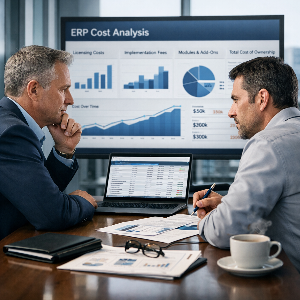
NetSuite pricing typically ranges from $25,000 to $300,000+ in the first year, depending on your users, modules, and implementation complexity. If...

1 min read
Managing a global business requires more than spreadsheets and regional accounting tools. Every time you expand into a new country, you take on new...